First designer at the company, halfway through a frontend migration and a rebrand
What to redesign, when?
Context and starting point
When I started at KYP (April 2024), I quickly noticed that design wasn't a priority yet. The company had grown like a true startup: not polished, but solving real problems with whatever was at hand. In recent years a product team had been set up so we could build with more focus and priority. It was actually that product team that decided designers were needed in the first place. When I got to know the company, I immediately saw the state the product was in. It was high time for a designer. Either way, it looked like a great challenge to me.
Once I got started, I also learned that we were in the middle of a technical migration of the frontend. It was already underway, so a full redesign wasn't an option. What was possible: grabbing all the low hanging fruit and cleaning up as much as we could, without creating double work for ourselves later.
At the same time, the marketing team was working on a rebrand towards a more modern look. That made it urgent for me that the product had to come along. This definitely didn't happen by itself, there were also just technical bugs coming from the product team. "Are we really going to change colors while feature X isn't working?" That's where it became clear that design still had a way to go. But nevertheless, slowly but surely, we went from a genuinely ten-year-old product to a brand-new-looking one.
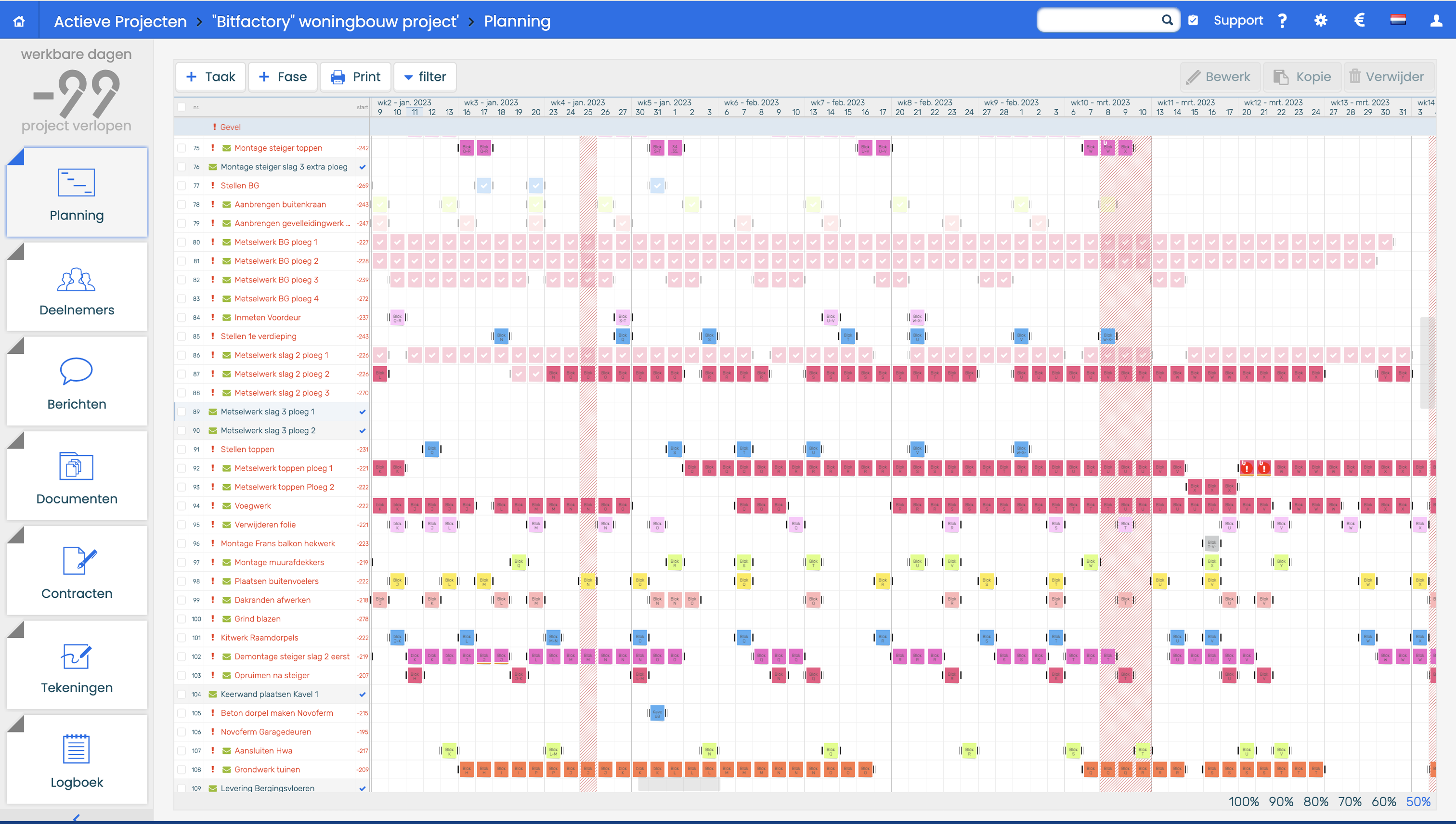
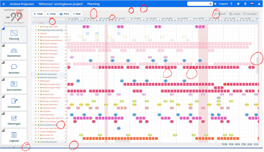
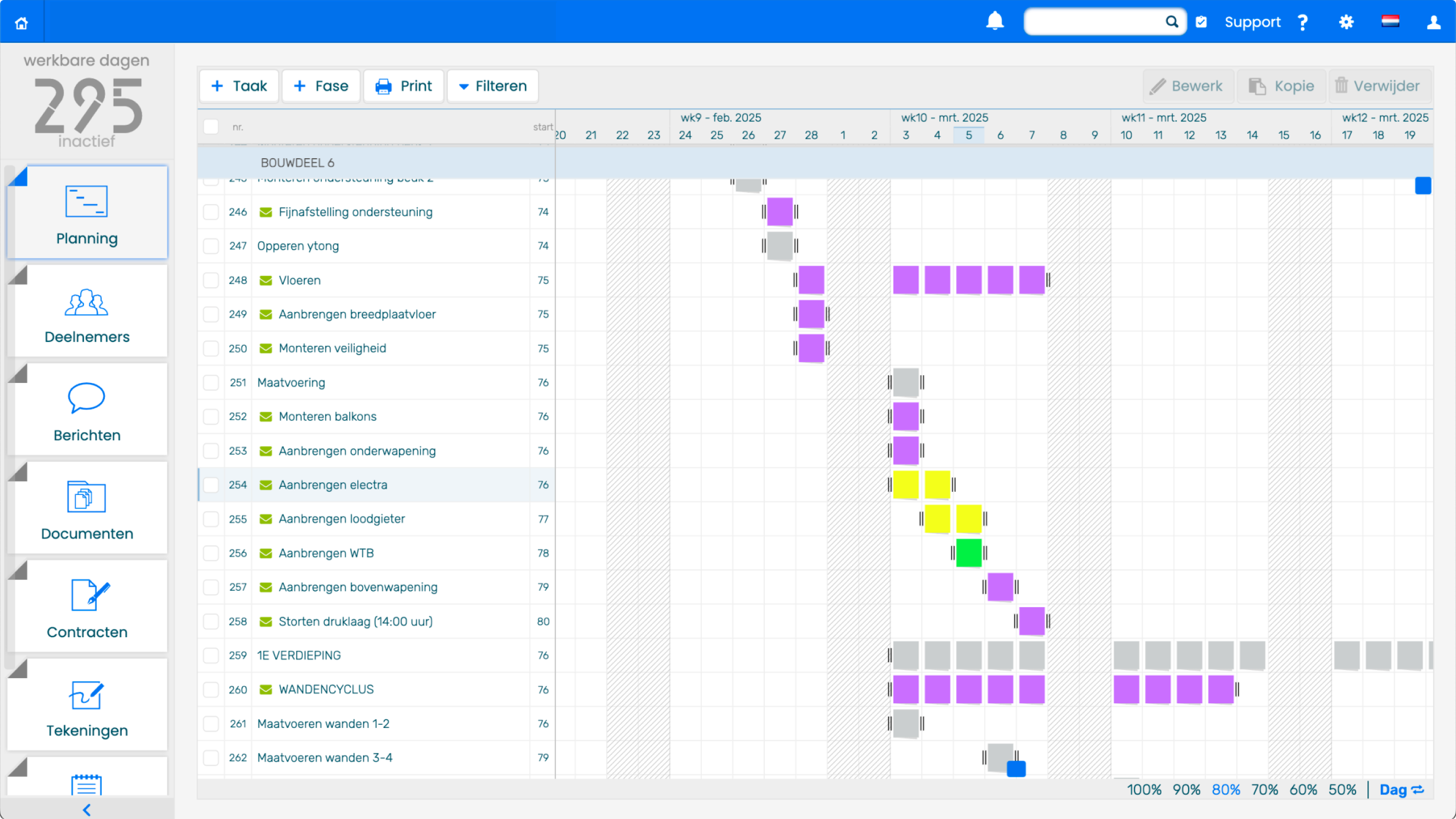
Planning screen, before
This is what KYP Project, the primary tool at the time, looked like and was currently being rebuilt 1:1 from the Grails frontend framework to Angular.
The proposal: why now was the moment
When I started proposing the cleanup angle, the product team was hesitant. They were under massive time pressure from the migration itself. The last thing they wanted was to introduce new variables into code that was already being rewritten.
But there was something that helped me make the case: marketing was rebranding in parallel. And the vision behind that rebrand was exactly what I was suggesting. Cleaner, more modern, unified. So I reframed the conversation: "We're not redesigning. We're implementing the rebrand efficiently by removing the clutter that's in the way." New colors, new fonts, less borders, more clean. That felt safer to them because it wasn't about adding risk, it was about reducing visual noise while bringing the product in line with the new brand identity. They came on board with that.
The CEO had a bigger vision though. He didn't just want a rebrand, he wanted to rethink the entire product strategy. The rebrand hinted at something bigger: moving from four separate tools to one unified brand with different solutions, more like the Adobe model. He wanted the product to signal that shift.
But we were in the middle of a migration. I couldn't redesign everything now. So I made the case: we do the cleanup now, implement the rebrand now, while we have the window. And at the same time we start planning the bigger strategic vision for how the products evolve together long-term. He accepted that.
That said, I didn't handle every detail perfectly in the execution. I made a couple of changes I didn't check with him about first. Things that visually looked like remnants of old design to me, but that he actually cared about. And afterwards, fixing them would have required going back into code that no longer existed, which wasn't possible with our team size and priorities. That stayed unresolved for a long time. I should have checked with him first.
But overall, he appreciated that I took his vision seriously and found a pragmatic path forward.
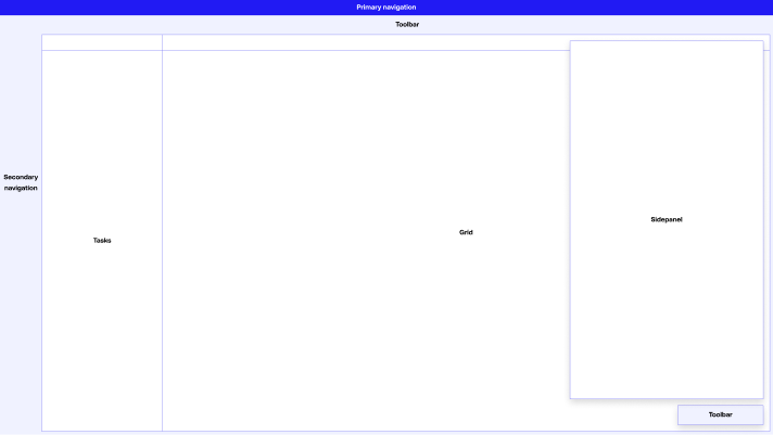
Vision sketch
High level visionary sketch of what a simple redesign would look like. Just realigning and simplifying the UI into a couple sections.
Approach: inventory and scoping
Before touching anything, I went out to see how people actually work. In my first few weeks I visited over twenty construction sites, sitting next to users for an hour at a time, watching them plan and asking what they had to do outside the software. Where were they still falling back on pen and paper or Excel? That taught me something that shaped the whole approach: the daily execution part already worked. People spend about five minutes a day in it and then get on with their job. That's not something you improve by redesigning it. That's something you protect, and make visually clearer.
With that in mind, I did a full UX audit of the existing product. I went through systematically to see what was working, what wasn't, what components were inconsistent, and what was just leftover visual noise from features or ideas that no longer existed.
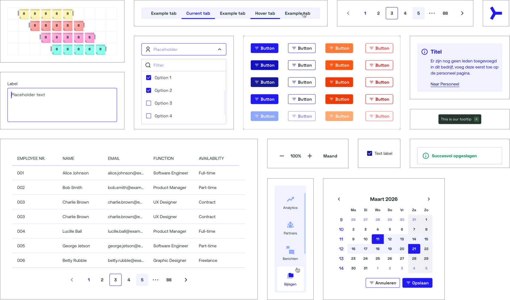
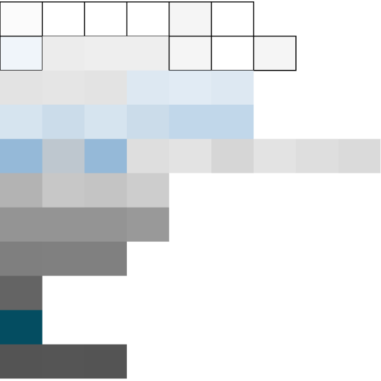
What I found was chaos, especially around color. We had what I started calling "fifty shades of gray". Leftover color variations from different eras of the product. Blues and grays that didn't match, inconsistent use across the interface. A lot of them came from features that were long gone, but the colors lingered. I simplified that drastically. Brought the grays down to three core shades, unified the rest, and then carefully integrated the new brand colors on top. The new brand was more vibrant, so I had to be thoughtful about how much to introduce at once to avoid making it jarring.
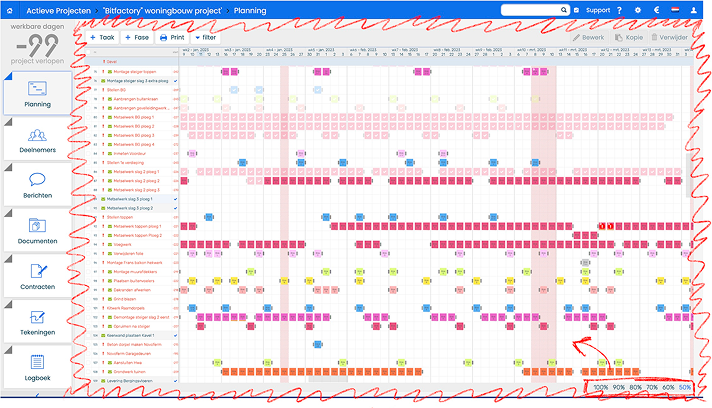
Audit pass
A session where I was looking for as much planning space as possible: a thick border around the whole area doing nothing, and the zoom controls taking up a full horizontal row while they could just sit on top of the planning screen.
Beyond color, there were a lot of empty HTML elements that were just serving as colored blocks. No functional content, just decoration. I proposed removing them entirely. I was cautious with typography and spacing though, because changes there tend to introduce bugs more easily.
When I showed this to the product team, they thought it would be way too much work. But when I sat down with development to validate what we were actually proposing, it turned out to be surprisingly minimal. Mostly just swapping out color variables and deleting those empty elements. Very little actual code rewrite needed.
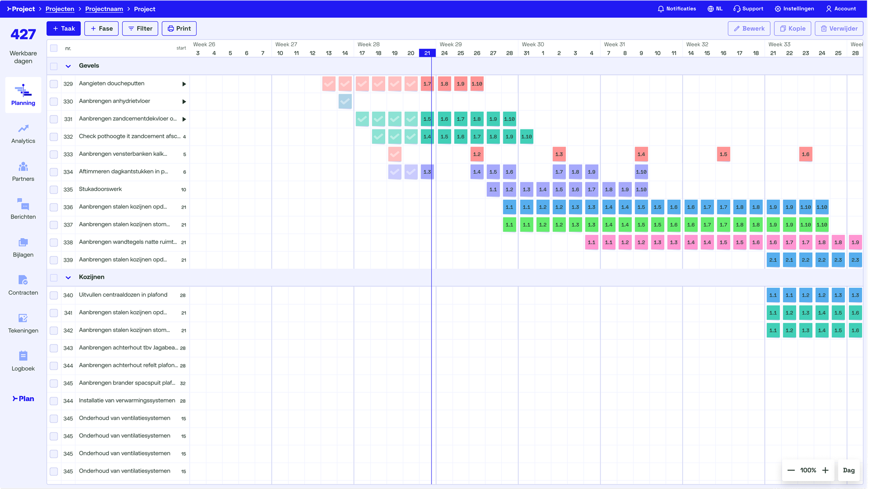
The payoff was bigger than the effort suggested: by removing all that visual clutter and tidying up the spacing, we gained two full rows of vertical space on the planning screen. More room for users to see their data, more information density, just from cleanup. That's when the product team understood. This wasn't busywork, this was actual improvement.
We broke the work into small tickets that could integrate into their existing sprint work rather than being a separate project.
Grey inventory
Left, every tint used to frame and separate the UI, called out on the screen itself — some of them are blue, but they were being used as greys. Right, the same tints pulled out and sorted by how dark they are. Once these existed as variables in Figma, which is what development actually consumes, most of the cleanup was just swapping one for another. Kobalt blue and construction orange came from the rebrand, the rest I built out around them.
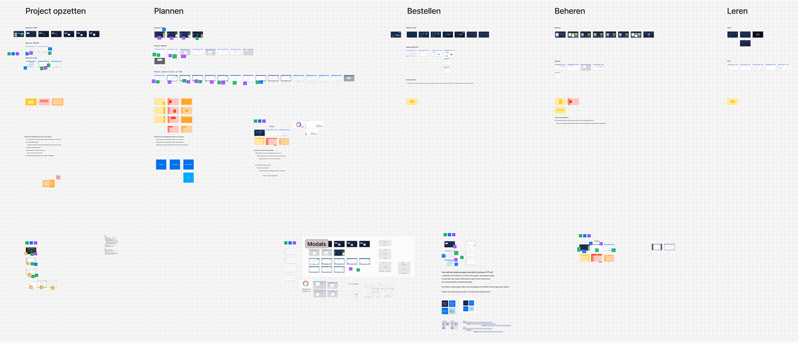
Research board
Larger research FigJam board comparing flows between the different tools, how they deal with things differently. Used to see if there are solutions we already liked which we could possibly take into this redesign to start aligning the very misaligned tools we had at this moment.
Old vs new
Left the cleaned up version, right the old one. Same screen, same zoom level. Removing the borders, the padding and the row of zoom controls gave us two extra rows of planning.
Prioritization
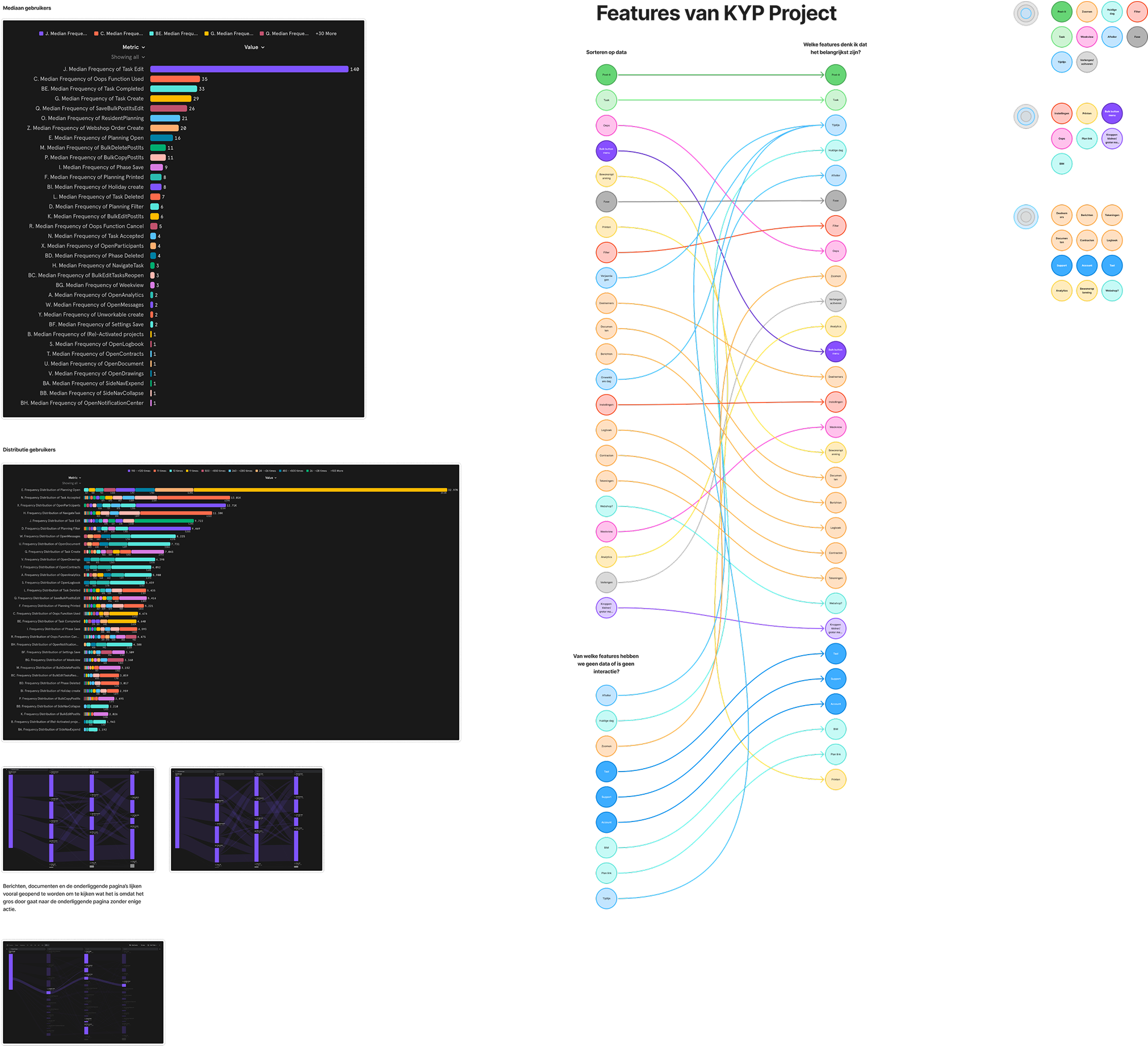
To decide what to tackle in the cleanup, I built a prioritization framework based on the main planning screen. Everything landed in one of three buckets: visible straight away, one click away, or two clicks away.
I used Mixpanel data to see what features people actually used. Some things sitting in prime space on the main screen were barely being touched, so those moved down. I also mapped which features we had no data on at all, so I knew where I was working on judgment instead of numbers.
It was one of several models I used to make sense of the chaos. The bigger thinking was about what was untouchable, what was prime real estate, and how features could eventually combine. Lots of different lenses on the same problem.
Usage data
Mixpanel data on the left, feature prioritization on the right. Every feature sorted by how often it was actually used, then by what we thought mattered for the business, and finally into what's visible straight away, one click away, or two.
Collaboration and trade-offs
During the work itself there was constant pressure from development and product. Bugs kept coming up from the migration, so they wanted to skip the design tickets, the colors, the fonts, the cleanup stuff, and focus on stability first. Which I get. But the CEO wanted his rebrand visible in the product, so those tickets had to happen. That put me in the middle, defending the design work over and over.
Sometimes the pushback wasn't even about the work itself, more like "no one's going to notice this anyway." Maybe true for a single border. But I just wanted a clean product, and all those little things together were exactly the difference between a ten-year-old product and a new one. My strongest argument was that the cleanup barely cost anything. Development could absorb it into the work they were already doing, mostly swapping variables and deleting stuff.
Next to the cleanup I was running a second track with the CEO: exploring where the product could go long-term. Different frameworks, ways to combine features that were now scattered all over the place. One concrete thing that came out of this was a floating toolbar on the bottom right of the grid, with just a few controls instead of options spread everywhere.
Since this was me asking for extra work instead of taking work away, I designed it so a single developer could pick it up whenever they had room. It sat on top of their new framework, so it didn't touch the migration or the rebranding work at all. That was my rule for the future-vision stuff: it had to be as light as possible to build, otherwise it would just die in the backlog.
So really I was running two conversations at the same time: "here's what we can do right now" and "here's how we could think about it later." Development handled the cleanup. The CEO and I sketched the future in parallel.
Impact
The clearest impact wasn't fewer questions from development, it was better questions. Because the system made things consistent, deviations became visible. Developers, who tend to be sharp at logical thinking, started asking "did you do this on purpose?" instead of "what color should this be?" That kept me on my toes too, and it turned into a real collaborative check on quality rather than me just handing off designs.
Product went through something similar. Once reusable components existed, they started questioning why we'd build something new when we already had a component that did the job well enough. That pushed us toward shipping faster with good-enough UX, instead of always chasing the perfect version first and slowing everything down.
On the user side I don't have a clean before and after, but a few things stand out. Support calls dropped to a handful. Partly the cleanup, partly because we made the existing help center actually findable, so people looked there first. What's left is mostly voucher validation and server issues, not people struggling with the interface. Over the same period the product grew from around ten thousand to twelve thousand daily users. That's mainly the account managers doing their job, not my design, but the product held up while it scaled.
Accessibility got a lot better too. Contrast is significantly higher, and a lot of small details, like type that reads clearer despite technically being smaller, are just baked in now.
The biggest shift might be in my own day-to-day. We started as two designers, and it's just me now. But because the system is so embedded across the team, design has basically become a Lego-block exercise. Product can assemble a lot of it themselves, and my role has shifted from producing every screen to polishing and making the case for why something works or doesn't. It's turned design into much more of a shared, collaborative exercise than it used to be.
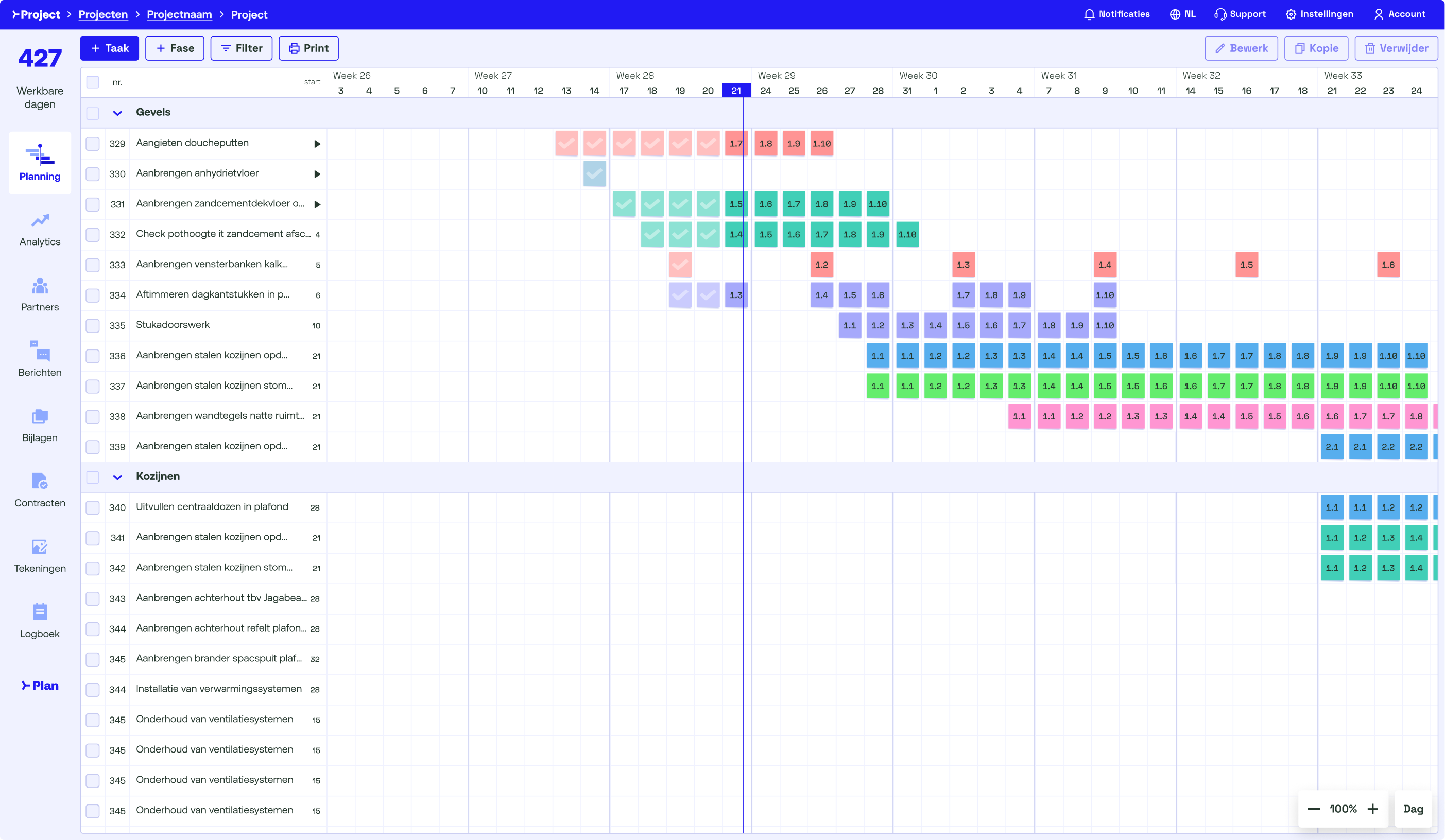
Planning screen, after
The same screen as the very first image in this case study, rebuilt. Same information, a lot less noise.
Reflection
What we built was a base, not a strategy. We got a consistent foundation, the new brand in the product, and a shared language between design and dev. That's real. But it's not the same as knowing where the product should go next.
On the user side I'm not too worried. They kept using it, support calls dropped, and the daily routine we protected still works. That's validation enough for me for this phase.
The harder part is internal. I never put numbers on what we did. How many colors we removed, how many components, how much dead code. It was a lot, but I can't prove it, and without proof it's hard to argue for the next step. That's the thing I'd do differently: measure while you're doing it, not after.
Because the next step is exactly where we are now. The migration is almost done, calendars are opening up, and the question is just sitting there: what do we build towards? Product and I have sat down with the CEO plenty of times, but it always stayed a vague direction instead of an actual decision. Part of that was out of our hands, the brand itself was still being defined with marketing, and it's hard to commit to a product direction when the brand underneath it hasn't landed.
So that's what I'm pushing for at the moment. Not another conversation, but one moment where we pick something and write it down, even if it's rough. Then at least there's something to build on, or to disagree with.
What came next
The cleanup wasn't meant to become a design system. It was just supposed to fix what was broken before the rebrand shipped. But once we had a small set of colors, real spacing rules, and a handful of consistent components, we basically already had the first building blocks of one, without calling it that yet.
That foundation, the colors, the spacing, the components, is what grew into the actual design system the team runs on today. It's also what made the next thing possible: prototyping straight against our real code with Figma and Claude Code, so product and I could try out competing concepts and settle arguments by clicking through them instead of debating static screens.
That's a case study on its own, and I'm writing it up separately.